Open post
A Few Good Men

A Few Good Tests

I watched A Few Good Men again recently and a quote sparked my thoughts on User Experience. As most things do. Captain Jack Ross (Kevin Bacon) says “I represent the government of the United States without passion or prejudice.”

Sure, this is how you want your lawyers to think. But this is also how good UX researchers and designers should treat design – without passion or prejudice. It’s obvious that a researcher should be objective about the design they’re testing but should a designer not be passionate? It’s great to have passion but not if it adversely affects usability or business goals. Design trends, such as the initial rush to flat design show, can negatively impact business as design decisions are made without testing with users. And as I may have mentioned once or twice over the years, if you don’t involve the user – it’s not user experience.

The problem frequently occurs when a hero designer is hired with the expectation of creating a functional, usable and aesthetic solution first time. That’s a lot of pressure and if that’s the expectation in the organisation then it may not be easy to put up your hand early on to ask which of these designs work better before continuing. This forces the designer to put great effort into one design which makes it harder to change later due to emotional commitment and the cognitive dissonance involved in accepting it’s not working well. Changing a finished digital product typically costs two orders of magnitude more than changing a design so from a business perspective it’s best to catch usability issues early.

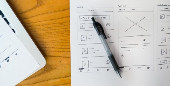
All you need is a few good tests (groan – but you knew it was coming). Testing designs with about six users per user group can unearth 80% of issues with a design. It doesn’t require expensive labs with one way mirrors or eye-tracking hardware just simply watch and record representative people using your designs while they tell you what they’re doing. Iterate. Test again.

It’s quite trite (even for me!) but the most famous quote, “You can’t handle the truth!”, is often the reason designers, developers and product managers will avoid usability testing. But it’s better business to test designs early and then be as passionate as you like about the detail of the one that works best for your users.

Open post
Office Space

What Would You Say You Do Here?

When somebody asks what you do, some jobs are easier to describe than others. Consider “I sell cupcakes with pictures of animals” compared to “I sell pneumatic adaptors, fittings and couplings to automotive manufacturers.”

If you can’t explain what you do to the two Bobs from Office Space you could be out of a job. So what does a User Experience (UX) person do?

Imagine an online retailer who sells products for the middle-aged and beyond, such as phones with easy to use buttons and watches with easy to read dials. First we have to establish who the site is really for (hint: ‘everyone’ is never the answer) so we create Personas. These enable the team to agree on the characteristics of the customer. Our persona in this case might be an elderly gentleman called George whose eyesight is not what it used to be. So should we make the text and images extra large to suit this type of person? Well, he might not be the only one using the site. Perhaps his daughter, Susan, is really the main customer. She is so used to other online shops that this extra large site is so jarring she quickly abandons it. Can you think of an elegant solution to satisfy these two requirements?*

The next step is to show how our persona interacts with all the touchpoints of our service. These are User Journeys and they encapsulate the requirements. This is not just the catalogue and shopping basket experience but perhaps it starts when they see an ad in a magazine, look it up the product on their smartphone in the coffee shop and later purchase it at home on a laptop.

Our next step might be to use one of the most powerful techniques in the UX toolbox – Usability Testing. We recruit the main types of users (a detailed persona means the work of defining this is already done) and ask them to perform tasks such as searching for a specific product by price or purchasing an item with PayPal while telling us what they are thinking. This can be on a live site or a prototype and gives us an insight not only as to which tasks are hard to perform but what they expected instead. Amazingly, you might only need to test 5 people to discover most of the pain points. Conversely, if you don’t test you will discover none.

From here we can use our interaction design skills and techniques to improve the site. Then test again. Remember, if you don’t involve the user, it’s not user experience.

“So, Bob and Bob, I find out from real users what’s wrong with a site, app, product or service and how to fix it with usable design.”

* If you can’t think of an elegant solution then why not join me for a workshop or a training courses?

Open post
Break Step

When to break step

There are basic design principles that you should stick to and there are some design elements you should never use. Right?

Design Patterns are recurring solutions that solve common design problems. For example, most online retailers use a design pattern that shows the product with a short description while giving the option to view more detail or buy now. Many academic sites tend to order their information in similar ways as their users are used to that style of site which, hopefully, was designed to reflect their understanding of that domain. When we drill down to the individual elements on a page, design patterns may determine certain principles such as the position of a search box at the top of a page or the placement of a privacy policy in the page footer. The patterns vary according to whom the site is targeted such as having navigation along the top (most people) or the side (engineers) of the page.

Similarly, there are principles that evolve where we learn what not to do. For example, there are many studies that show that users hate scrolling sideways. So does that mean we should never allow it? Should we redesign legacy systems that employ horizontal scrolling to eliminate it? Well, if it was a website for a mass audience then we most likely should. But, and this is the heart of user-centred design, if we were designing for a niche financial audience for whom Excel is second nature, then probably not.

But what if the customer was the Excel expert but the software will be used by an assistant not so familiar with Excel...

Ideally, we would perform usability tests on prototypes of both types of system with the actual users to find out which is more efficient and which they prefer before making the design decision. People vary greatly between groups so what is good for the goose might not be good for the gander.

Scroll to top