I was immersed in an Internet TV project for Sky when Walter Isaacson’s biography on Steve Jobs came out in 2011 so was deeply interested in Apple’s vision of the future of television. Tim Cook says it’s apps. Unfortunately, so is the present.
The three most irksome areas of TV usability are zap time, issues with non-standardised interfaces and shockingly poor information architecture.
The zap time is the total duration of time from which the viewer changes the channel to the point that the picture of the new channel is displayed. It’s a feature of all TV systems but more pronounced in digital services due to network factors, buffering and access/rights checking etc. However, switching from live TV to an app or switching from one app to another is so slow that the zap time is huge which makes the viewing experience excruciating.
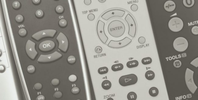
As all apps have unique interfaces it means having to learn multiple ways to use the same buttons and icons as they have different meanings and actions across apps. For example, on many interfaces a programme can be paused and restarted with the pause button but on NowTV the pause button will pause it but only the Play button will restart it. To try and remember what everything means in each app is now a significant cognitive load.
The phrase Smart TV reminds me of Don Norman when we said “We now have very smart devices, stupidly done.” When you start your Smart TV, Amazon Fire, Apple TV, apps or whatever service you prefer it usually looks like someone was force fed a shedload of channel logos and series hero shots before vomiting on the screen. The user journey of browsing for a programme has become significantly longer as we struggle with cluttered interfaces filled with unintuitive categorisations. Ignoring that the programmes are organised differently in each app, the information architecture of the current services break the guidelines that have been established over the past 30 years. But that particular can of worms is too large and wriggly for this article.
These factors combine to make previously simple tasks such as finding a show or even changing channel exceedingly slow and harder to complete correctly due to an increased cognitive load.
Services like Sky and Virgin provide a single interface to provide all their content so you can access, for example, BBC, ITV and Sky programmes through a common interface without having to endure the zap time of switching to iPlayer or another app and then trying to remember the quirks of searching in that unique interface. (This works by curating all the programmes’ metadata but again, too large and wriggly an area for here.) But it doesn’t work for Netflix, Amazon Prime or other subscription series yet. The holy grail is to have a service that acts as a central sign in for all your apps and live TV and then provides a single interface with decent information architecture to all your shows.

